TIAA, Consultant Experience
TIAA, Consultant Experience
Contributions
I helped lead the re-design of our new plan sponsor dashboard with a focus on simplifying complex retirement plan data into a clear, actionable experience. My work centered on creating an intuitive interface that gave plan sponsors confidence in managing plans while strengthening their connection with participants.
Collaboration & Leadership
Partnered with product managers to solidify requirements, ensuring the project goals aligned with both business needs and user expectations.
Worked closely with developers to understand technical feasibility, shaping solutions that balanced design intent with implementation realities.
Collaborated with B2C and B2B stakeholders to align on best practices and converge on the strongest design solution.
Tactical Execution
Created and iterated on multiple screen variations to explore design directions and capture stakeholder feedback.
Managed the component library for our channel, keeping patterns consistent and reusable across the experience.
Maintained dev-ready design files, ensuring engineers had accurate and up-to-date specifications for implementation.
Built and updated interactive prototypes to share with stakeholders and support decision-making.
Partnered with research to plan and support user testing, validating design decisions with real userfeedback.
Previous Experience
The legacy homepage created unnecessary friction for plan sponsors, with issues that limited clarity, efficiency, and actionability. This created three core problems:
Information Overload
Users had to sift through large volumes of raw data, making it difficult to identify what was most important. Critical plan health metrics were buried and hard to act on.
Lack of Clarity in Navigation
Users were forced to jump between multiple pages and systems to get a complete picture, leading to inefficiency and frustration.
Ineffective Notifications
Critical updates were easy to miss, often hidden inside dense reports with no clear prioritization
Updated experience
In the redesigned homepage, we focused on creating a clearer, more intuitive experience that simplified navigation, prioritized key insights, and surfaced important alerts in a way that users could act on immediately.
Streamlined Content
We removed unnecessary complexity and restructured the page, surfacing the most important insights upfront so users could act with confidence.
Simplified Navigation
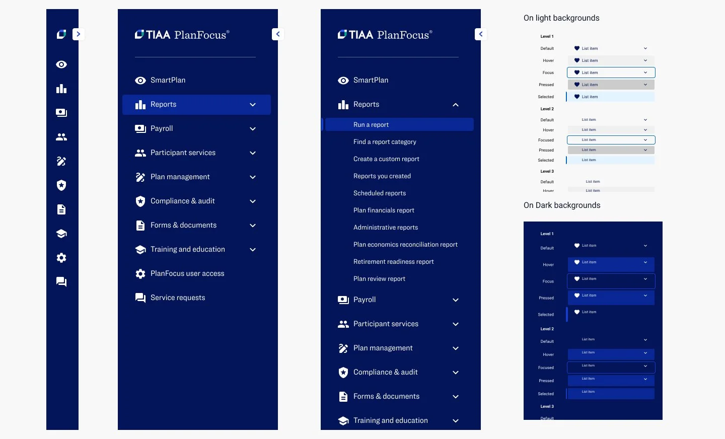
By restructuring the information architecture and implementing a collapsible side navigation, we simplified navigation patterns, reduced friction, and enabled users to move seamlessly between key sections.
Prioritized Alerts
We introduced a dedicated alerts drawer, categorizing updates into actions and notifications so users could quickly distinguish urgent tasks from general updates and stay focused on what mattered most.
Additional Work
Login Experience
Updated Logo Lockup
Dev Ready Specs
Channel Component Library


